Google DoubleClick
B2B Marketing Platform
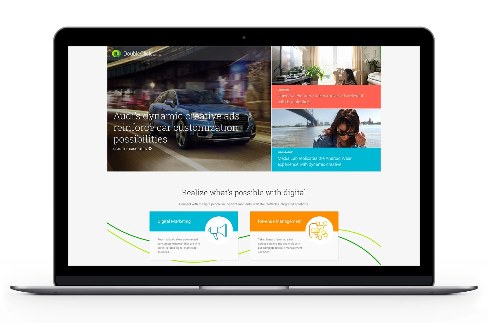
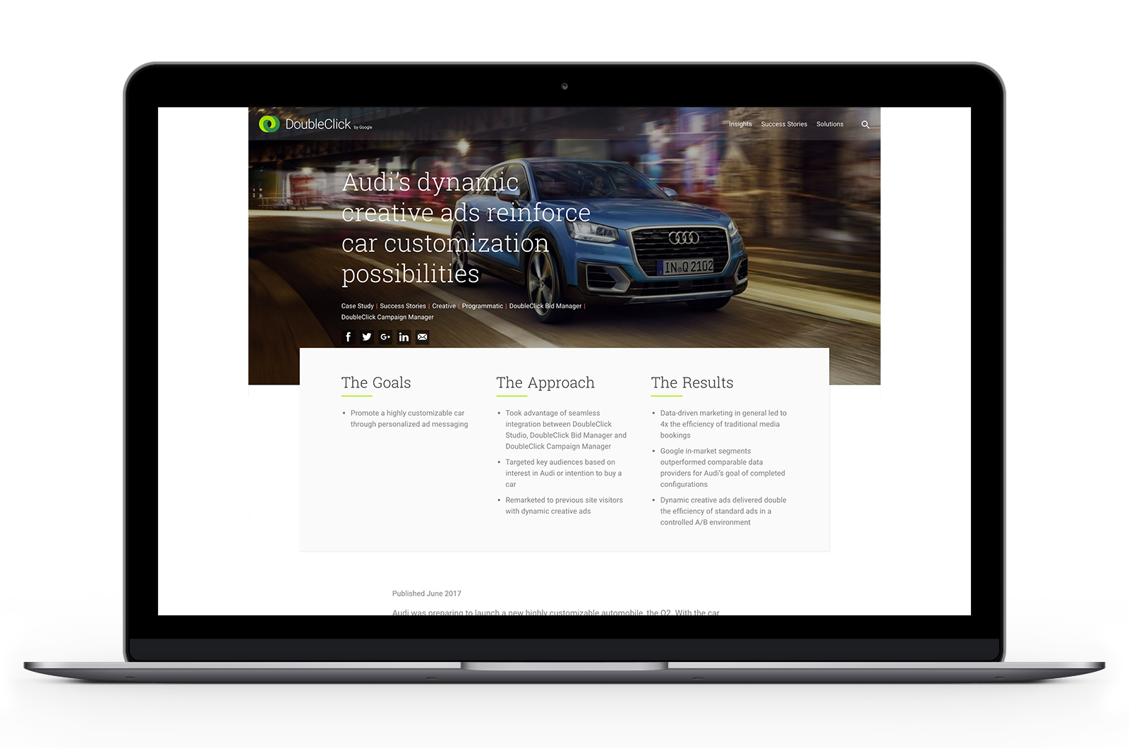
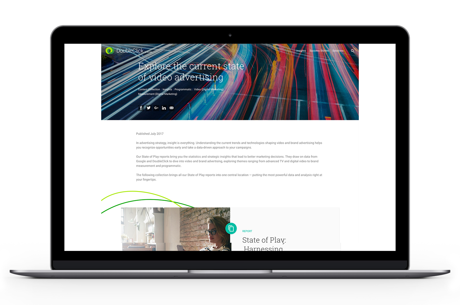
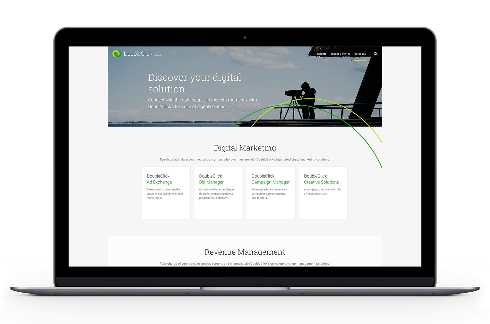

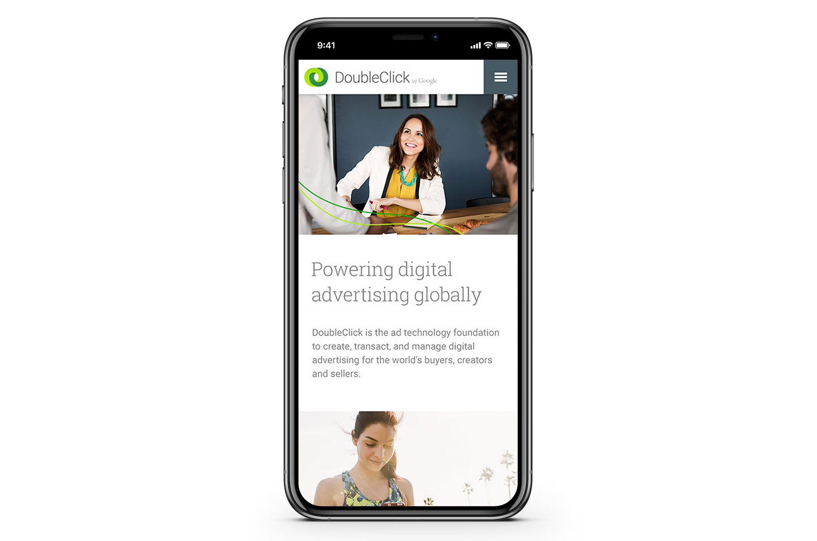

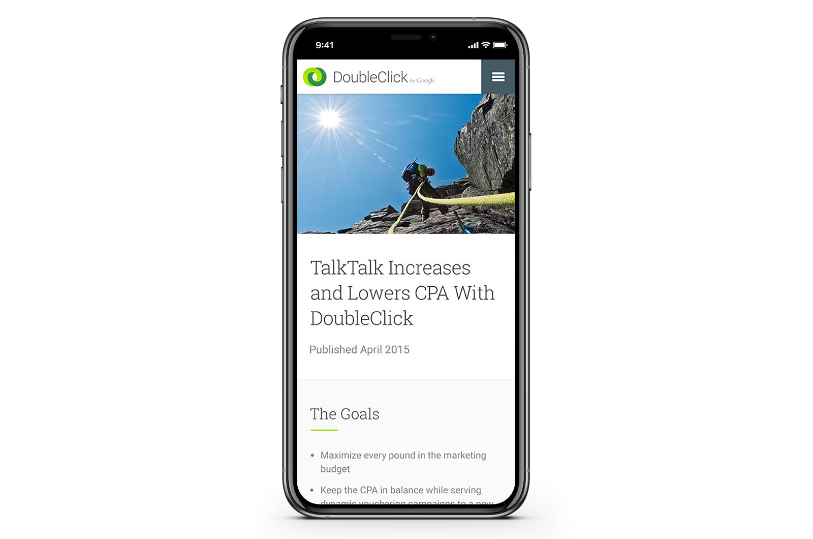
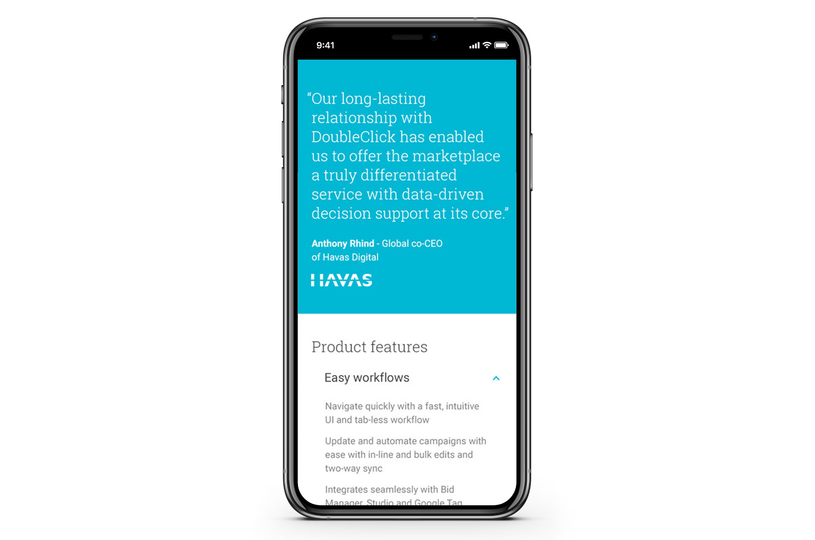
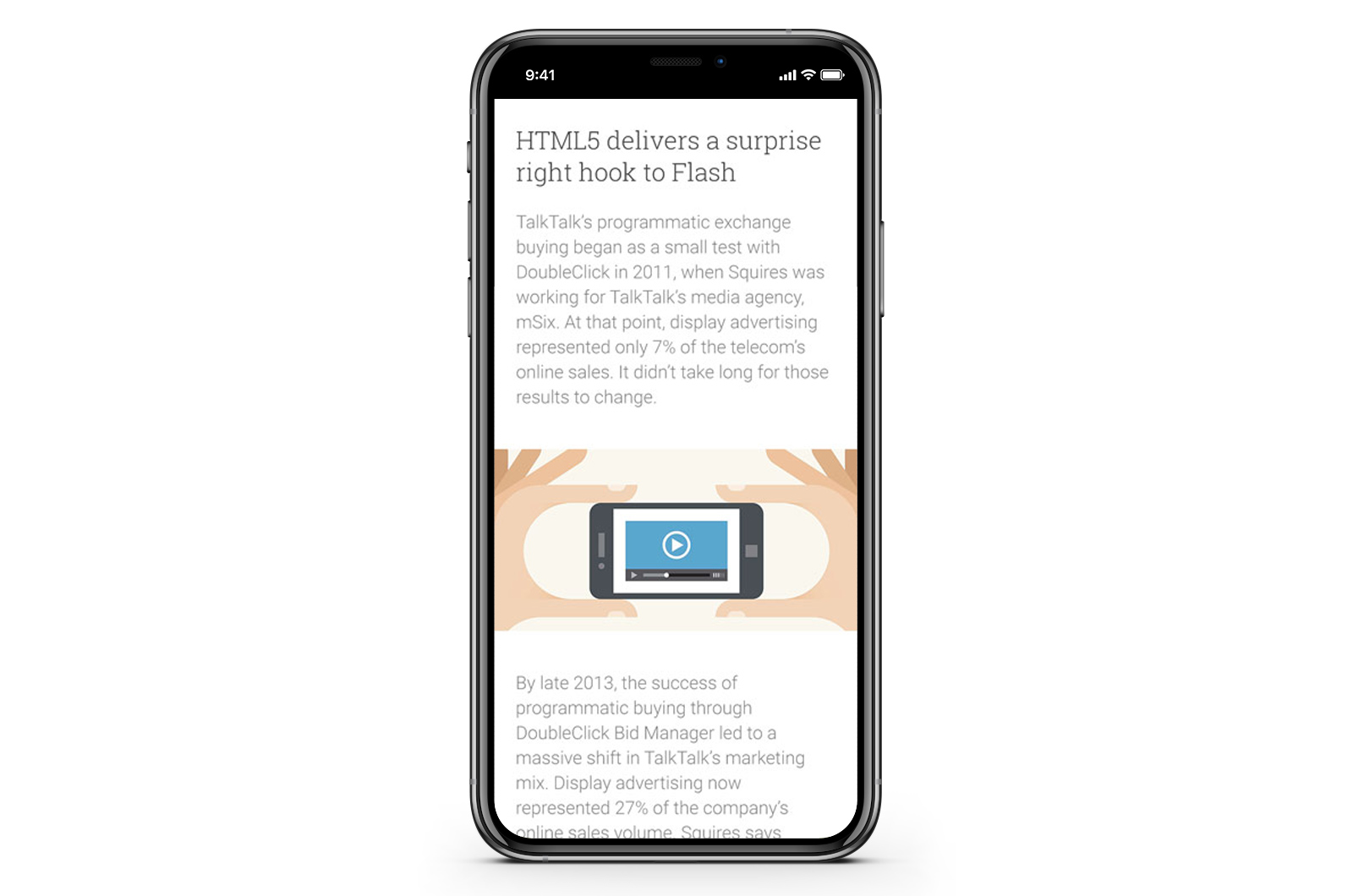
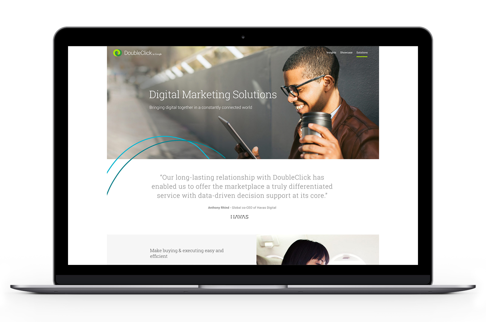
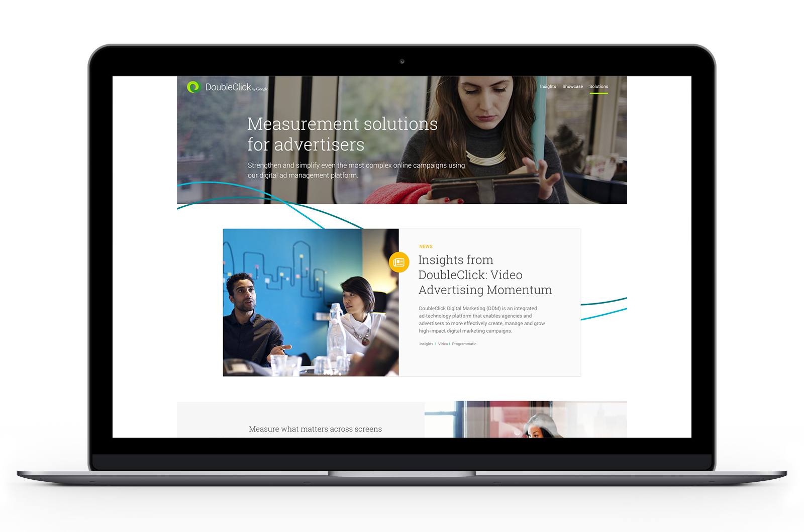
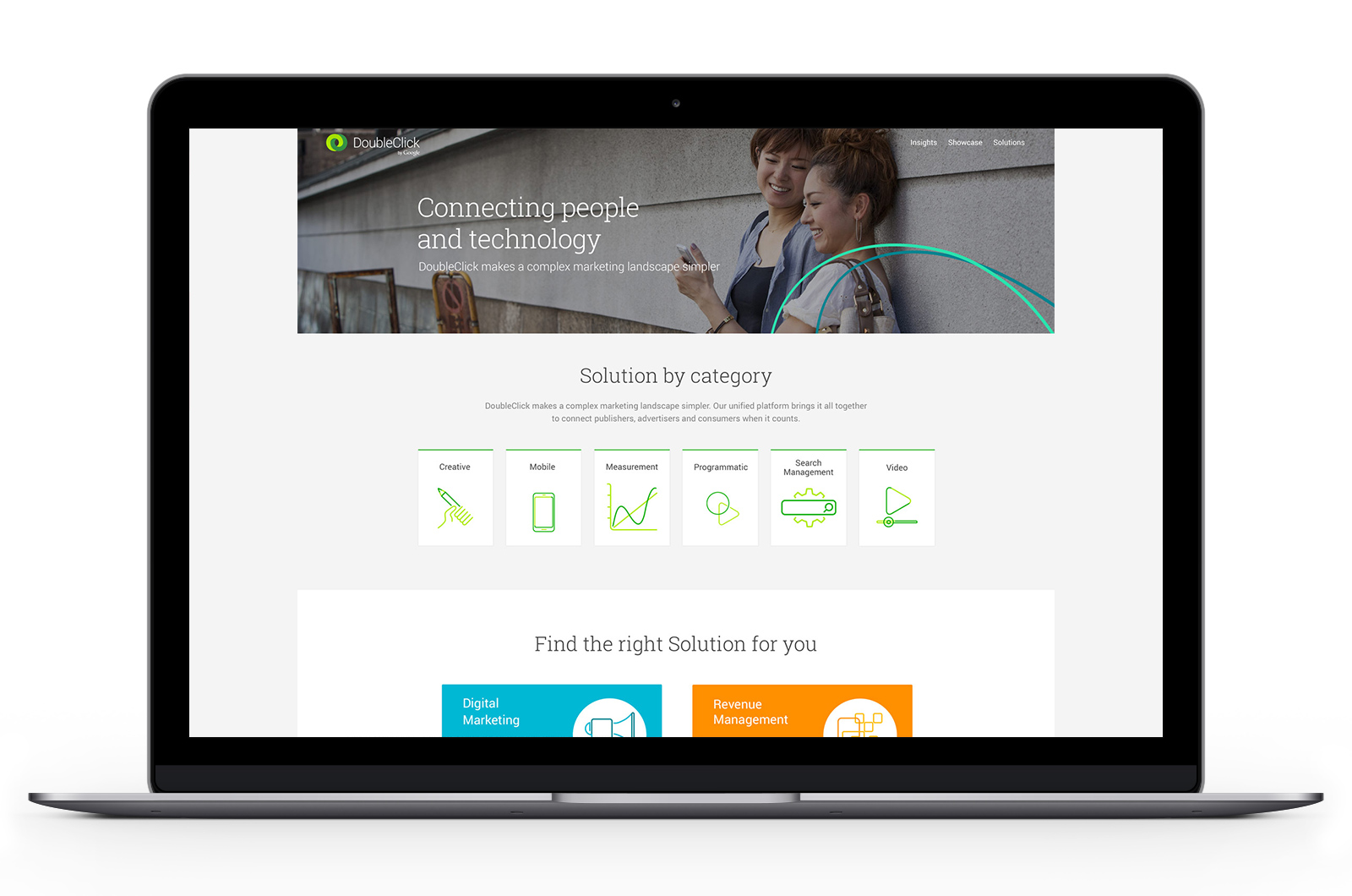
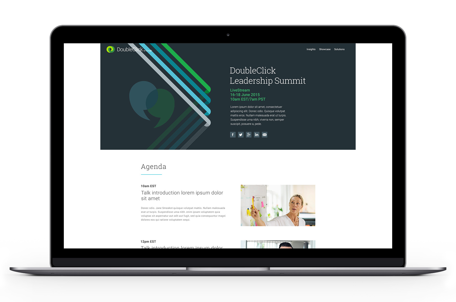
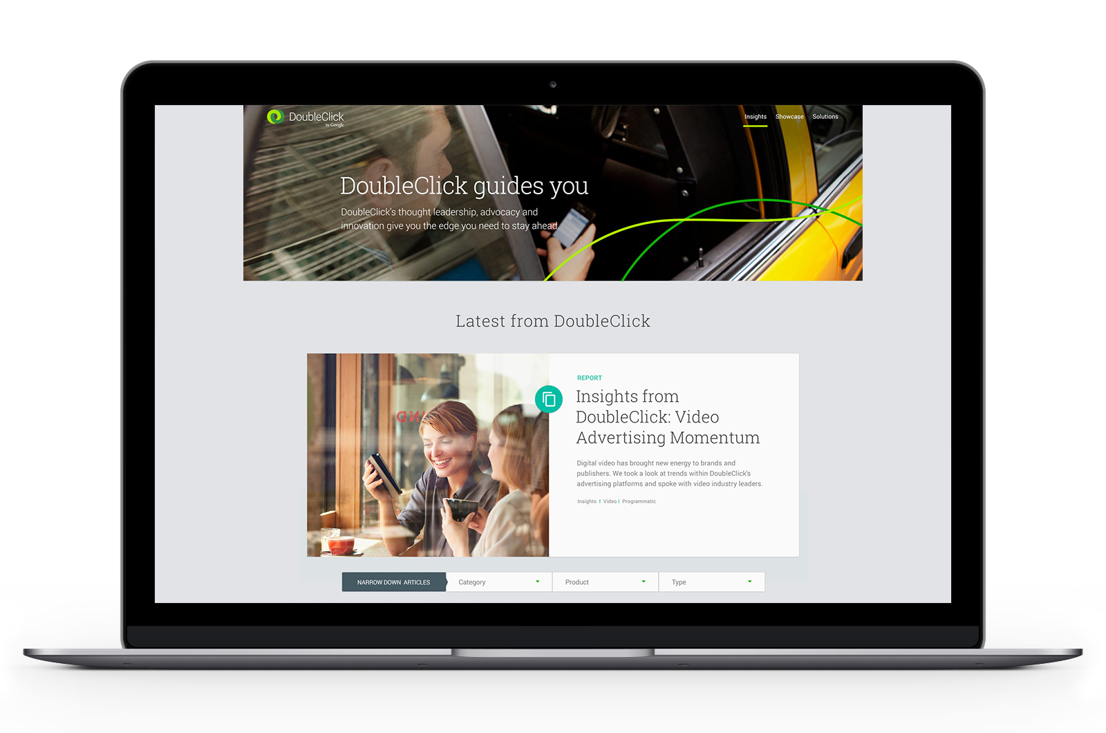
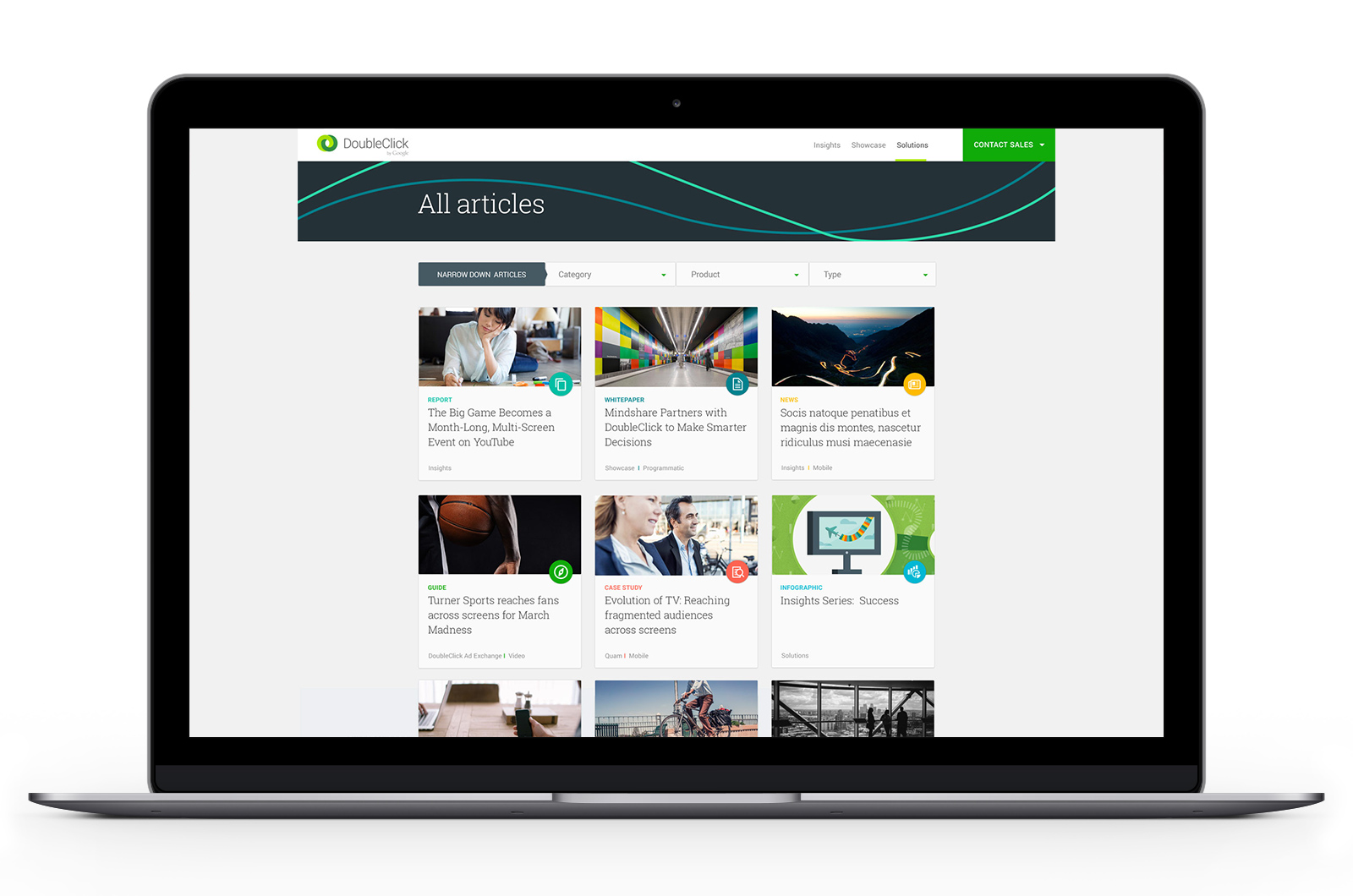

In 2016, I led UX on the B2B marketing website for Google’s DoubleClick
The challenge: DoubleClick needed to develop a digital presence that inspired advertisers and publishers about the power of programmatic technology.
The objective: Use targeted content that communicated real business impact as a means to increase product exposure to Advertiser and Publisher decisions makers.
The solution: A new content ecosystem that best represented DoubleClick’s new human-focussed brand identity – packaged within a modern, responsive platform.
The result:
371% increase in engagement that prompted 30% more users to explore multiple DoubleClick product.
Project kick-off / enhance domain knowledge
My team and I took to the whitewalls to knowledge share by fleshing out the Advertiser-Publisher ecosystem that DoubleClick works off of. This provided the team with an aligned understanding of the new platform’s audiences, as well as a greater understanding of how each audience type relates to one another.
Internal war-room ‘project kick-off’ photograph
Buy-side (advertisers) / Sell-side (publishers) ecosystem - whitewall
Buy-side (advertisers) / Sell-side (publishers) ecosystem - digitized
Stakeholder workshops
We worked with the Product Owner to determine and prioritize the content types the new platform would support. We then prioritized features using the MoSCoW method of prioritization.
A handful of the workshop participants
Content prioritization
MoSCoW feature prioritization
First-pass site structure and information architecture
We had built up a strong understanding of DoubleClick’s ecosystem, the project goals and prioritizations, as well as the audiences and their needs. We proceeded to create first-passes at the site structure, specifically targeting how to journey traffic through to DoubleClick’s products – via targeted content.
First-pass sitemap
High-level wireframe - homepage
High-level wireframes - site-wide
Higher-fidelity structure
After a handful more workshops and iterations, we had settled on an aligned approach to the platform’s information architecture and journeying. This allowed us to begin adding more design detail to each of the site’s sections.
Digitized sitemap
High-level wireframes - digitized
Templates (to be designed) based off the site structure
Wireframes
A selection of detailed wireframes I had created for DoubleClick:
Final UI designs
Mobile UI designs
The result
More engaging content that prompted users to explore deeper into the marketing funnel
On launch, doubleclick.com saw a 371% increase in engagement of active users (users who visited article content). Overall time-on-site increased 2X, with a 25% increase in returning visitors. Users who viewed product pages were 30% more likely to view multiple DoubleClick products.


