Comic Relief
Sport Relief Registration & Donation Platform
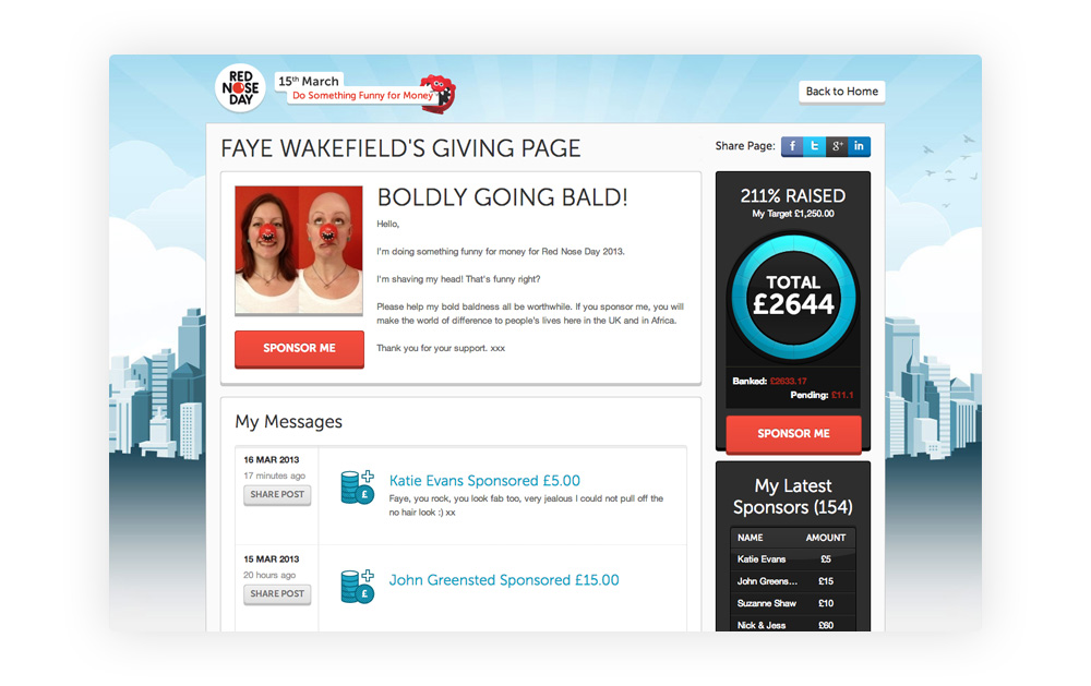
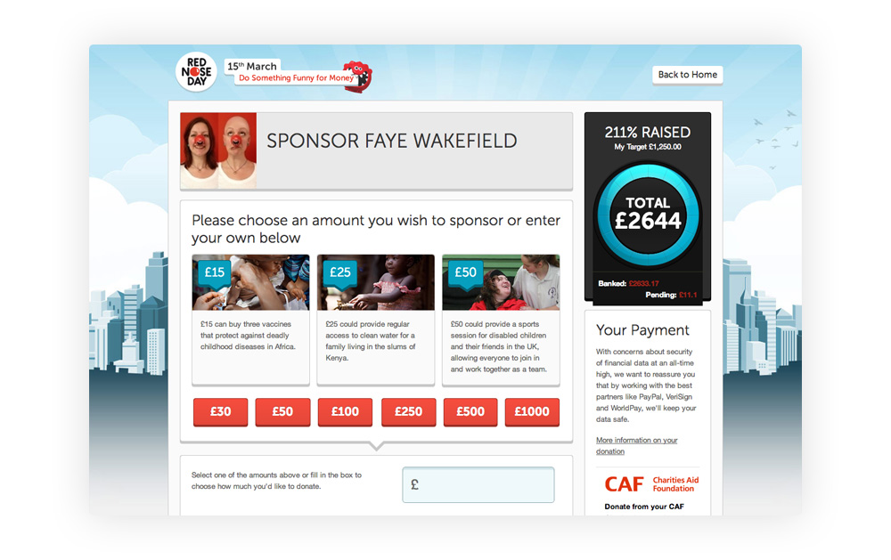
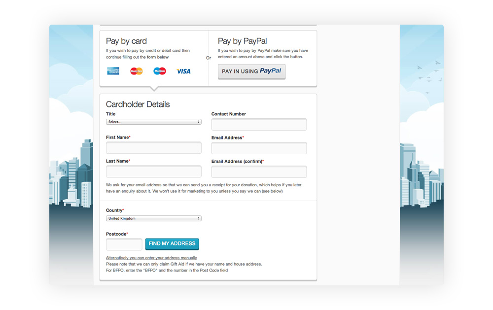
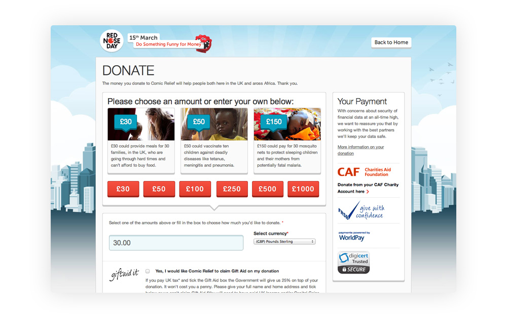
In 2012, I led the UX for Comic Relief’s highly-successful Sport Relief platform
For my first collaboration with Comic Relief, and to coincide with the London 2012 Olympics, I designed the registration, donation and payment journeys for Sport Relief. Millions of people were expected to place transactions on the platform during 2012.
Comic Relief are the organisers of Sport Relief’s charity fun-run, called “The Mile”. The Mile is the largest charity fun-run in the UK by total volume of participants.
The platform needed to work fluently across desktop, tablet and mobile.
Researching the audience
One of my first tasks was to turn Comic Relief's marketing personas in to UX personas (see "Costly Mistakes in Persona Creation: Marketing vs. UX Personas"). To do this, I worked with Comic Relief’s researchers to gain a deeper understanding of my intended audience.
I also spoke with 15 users who had entered the previous Sport Relief fun-run in 2010 and who intended to run again in 2012. From this research, I crafted a small number of UX-centric personas, covering end-user goals, values and technical competencies.
First-pass at breaking down Sport Relief's demographics
UX-centric personas were heavily based on family connections
Learnings
“Registration by proxy” for parents and teachers
I found that a large percentage of potential entrants had a preferred method of registering. This was based around their family connections. For instance, parents wanted the ability to register their children and not themselves. School teachers and leaders were similar too. This led to a "registration by proxy" user flow being created.
“Continue my registration” for friends of friends
I also found that adults alike were more likely to register other people (e.g. their friends’ children) after they've registered themselves – but not necessarily at the same time of self-registration. This led to the creation of a "continue my registration" user flow.
“Pull previous details” for previous years’ entrants
Additionally, I discovered that entrants were more willing to engage if their previous activity with the platform had been taken in to consideration i.e. a "2010 Sport Relief user" flow: "if I've signed up before, can you remind me and just pull my previous details?"
Personas to user flows
Using actual Comic Relief volunteers as a focus group to validate my hypotheses, and to further establish the requirements that would inform my user tasks, I drew up a number of illustrative workflows, representative of the newly established UX-centric personas:
Wireframes
Once personas, user tasks and key user journeys had been completed, a number of detailed wireframes and storyboards were created. These, in-turn, informed the UI design:
Final designs on the walls
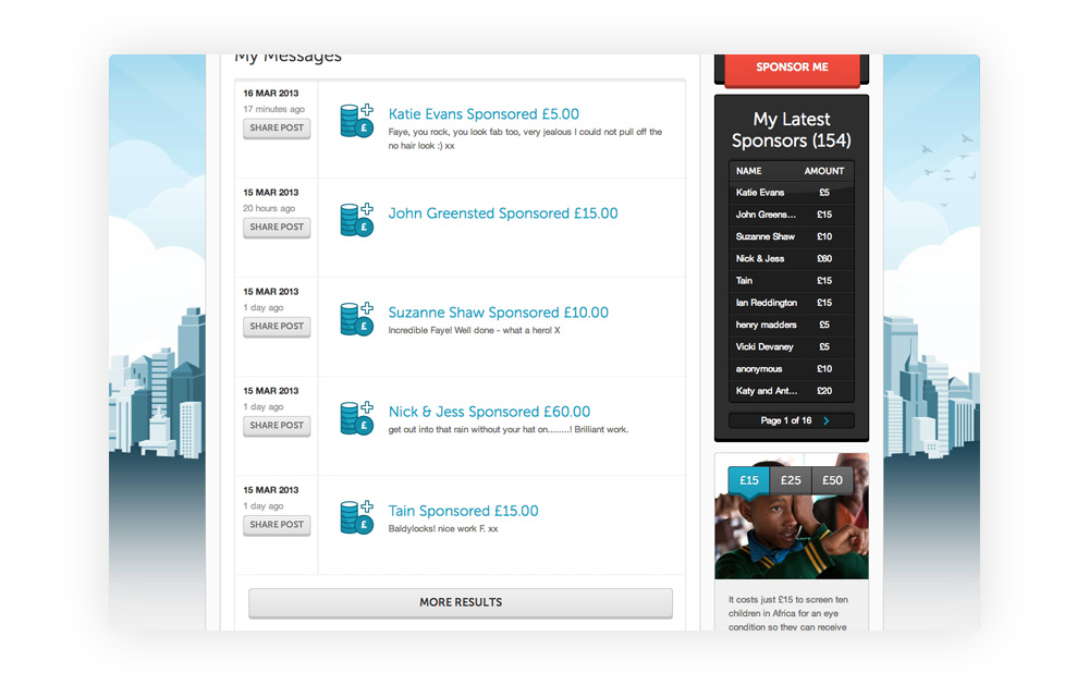
Final “Top Story Timeline” UI
The result
A £50 millions success!
Sportrelief.com, launched at the very beginning of 2012.
The platform saw more than one million amateur and professional runners from up and down the UK entering the event. Even The Queen gave a royal start to the Sport Relief Mile!
Every participant, as well as those registering on the participants behalf, successfully applied for The Mile using the registration platform I had designed. To test that everything I had designed was working as expected, I just had to enter The Mile myself!
Along with one million other participants, I helped raise £50,447,197 for good causes at home and abroad – the highest figure ever raised for Sport Relief at the time.


