Virgin.com
Content Publishing Platform
In 2014, I led the UX and UI design of the new virgin.com content publishing platform
I was keen to ensure the experience of Virgin's new content publishing platform, Virgin.com, matched the expectations of Richard Branson and his followers. My responsibilities spanned persona work, IA and journeying, wireframes and UI design. I designed the new Virgin.com around the needs of three key audiences: those interested in travel, music, and entrepreneurialism.
Personas and key top-level ‘red-routes’
I sketched a number of high-level “rough” IAs and journeys. A number of these early prototypes were turned into reverse-tree tests that were then used to validate assumptions. The feedback from these tests in-turn informed the broader sitemap, as well as logical user red-routing that connected audiences with content.
The first Virgin.com sitemap was turned into an unmoderated tree-test
Virgin "workflow" personas & high-level user journeys
Initial journeys and information architecture
For the first round of journeys & preliminary information architecture, I took to the whitewalls, Sharpies and Post-Its in-hand
Initial Virgin,.com wireframes
The Virgin.com shared space; most of the alignment between team and stakeholders happened in here
More sketched wireframes
Higher-fidelity IA & user routing
A version of the new Virgin.com menu that had validated positively through panel-based user testing
Responsive design approach: how content expanded/collapsed depending on the view-size of the user agent or device
The final Virgin.com sitemap. The sitemap also shows user "red routes" (the user's primary journey/s through to important content)
Validated concepts moved from discovery to delivery
Designing lean allowed me to put concepts in front of Virgin's user focus panel for quick testing and high-level actionable feedback. Working in this way meant the team quickly determined which ideas worked - and which ones didn't. The concepts that resonated with end-audiences were polished and recorded in to a high-fidelity format, usually for stakeholder presentational purposes with stakeholders over at Virgin.
Once stakeholder buy-in had been achieved, and after the initial IA had been validated, I began fleshing out the higher-fidelity layout and overall design of the new Virgin.com for the delivery stage of the project.
Article blocks/creation steps
Virgin main menu
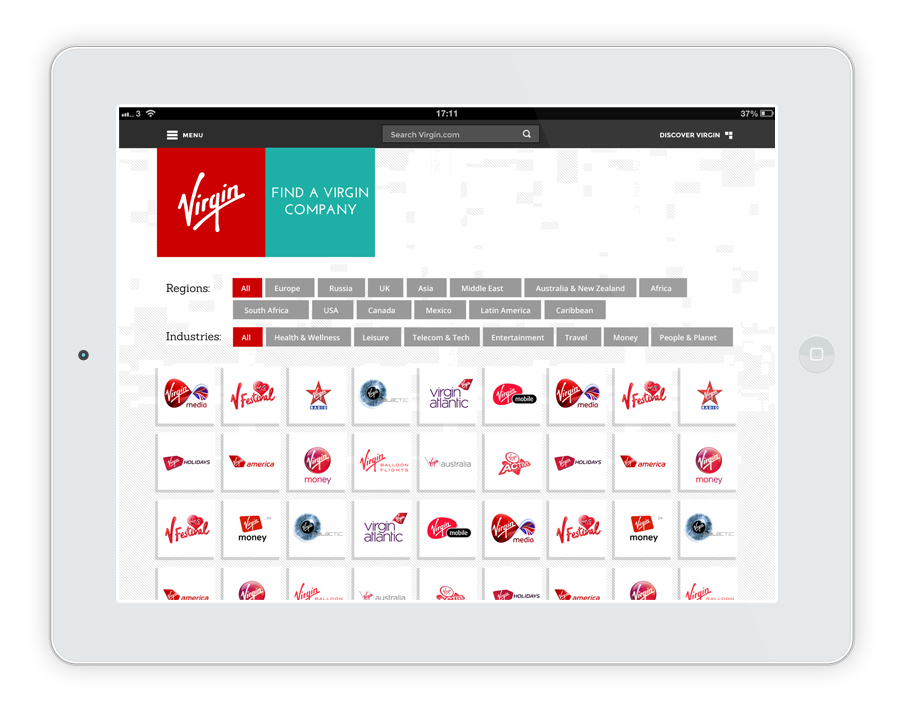
Virgin companies menu
The new Virgin.com homepage
Richard Branson's landing page
The company page
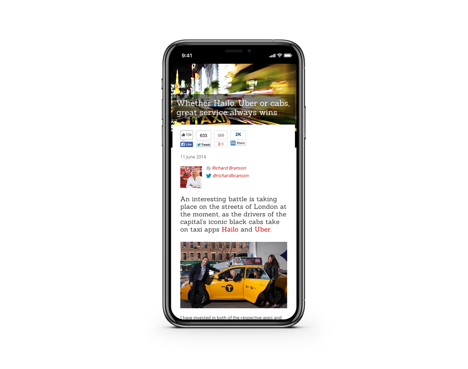
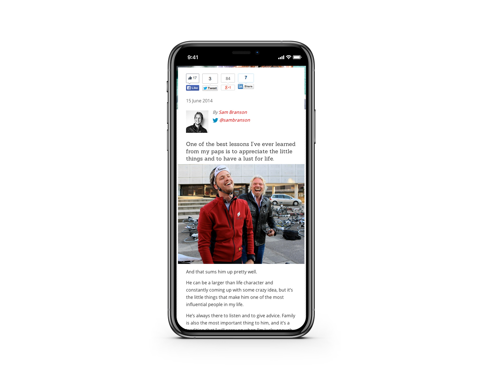
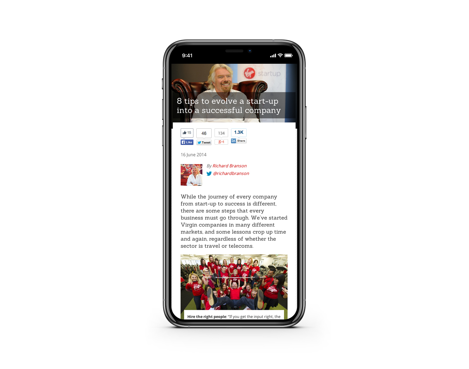
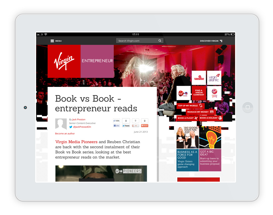
Published article page
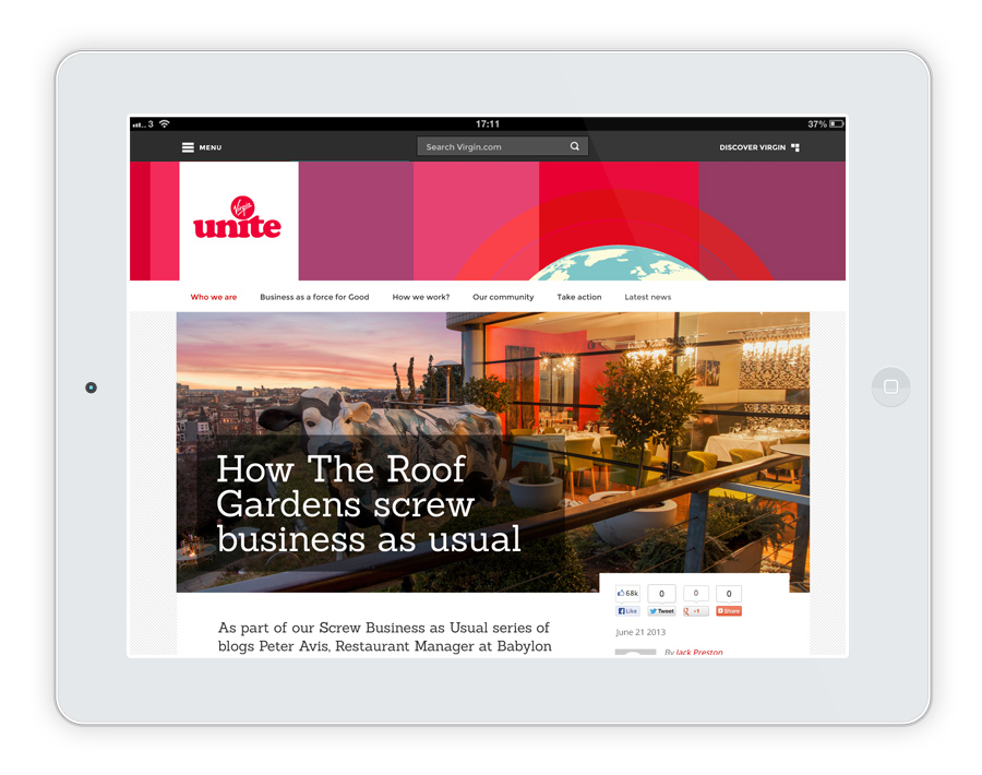
Virgin Unite page
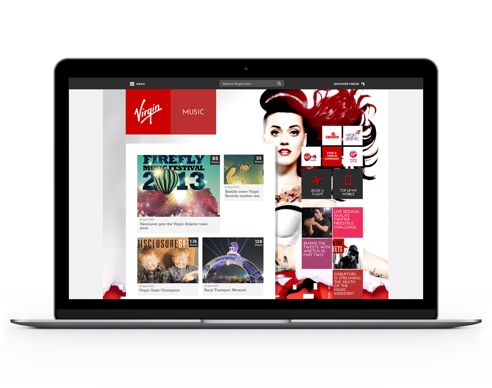
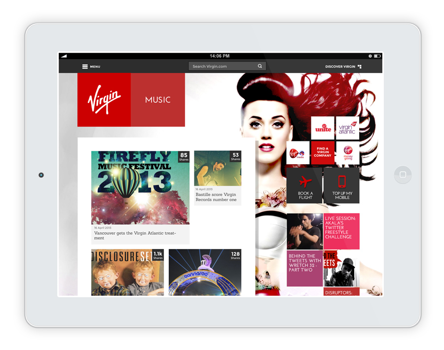
Virgin Music page
Richard Branson visits the Virgin.com team
Richard visited to say thank you for all the hard work
As it’s Richard, he’s naturally very smiley :)
We made Richard tea
Richard meets the entire Virgin.com team
Fully endorsed - Virgin wireframes are officially signed off
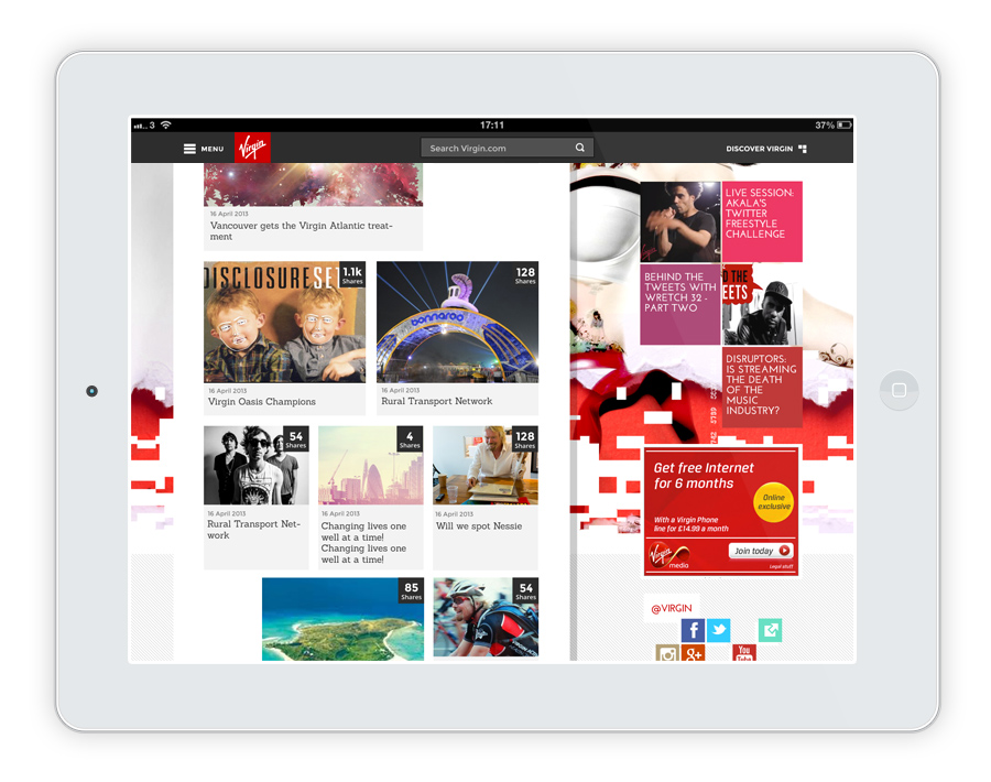
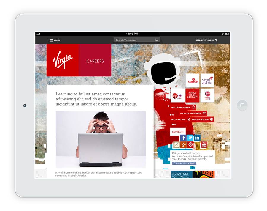
Final UI design
Mobile layout
Desktop layout
The result
More users engaging with more content, for longer
After launch, more than 1.9 million unique visitors viewed content on Virgin.com every month. Article views increased by 32% per visit. Audiences also spent double the time consuming content – a 107% total uplift in time-on-site.
Similar work


